San Marino Beauty Labs
Work
BRANDING / ART DIRECTION / DESIGN / WEBSITE
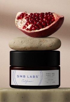
SMB Labs' visual identity seamlessly integrates the art and science of skincare. The sophisticated and ethereal design draws inspiration from CEO, Cindy Kuo’s, unique journey, rooted in timeless Asian philosophies and techniques learned from her grandmother in Taiwan. This ethos emphasizes authentically sourced, organic ingredients, elevating skincare beyond the brilliant formulations to embody self-love, ritual, warmth, and storytelling. The challenge presented in designing the the brand was equally conveying efficacy, scientific expertise, and continuous innovation while transcending the role of a traditional formulation lab, guiding clients on an artistic journey to create holistic systems alongside their products.
The double-ring logo symbolizes the delicate balance of art and science, merging these elements to form a perfectly unique identity. Echoing the structure of a skin cell or tree rings, the design centers attention on the wordmark, which features a smart, modern, and strong typeface harmonized by the thinner circular surroundings. The overall concept incorporates warm, natural colors, reflecting SMB Labs’ commitment to organic ingredients and sustainable practices.
The color palette reflects the harmonious relationship between earth and sea, combining warmth and tranquility. Blue represents the sky and seas that have inspired skincare for centuries, symbolizing serenity, revitalization, and dependability. This choice also pays homage to Cindy’s journey, beginning near Taiwan’s coastal regions and continuing to San Marino, California. Blue further underscores the high-quality ingredients sourced from the ocean, encapsulating the essence of refreshing and rich skincare.


